
Cannabis Ecommerce Website UI/UX
Redesign for Weed Messenger
- Weed Messenger
- Cannabis Technology
- Website Redesign
- 1 UX Researcher, 2 UI Designers
- 1-2 Months
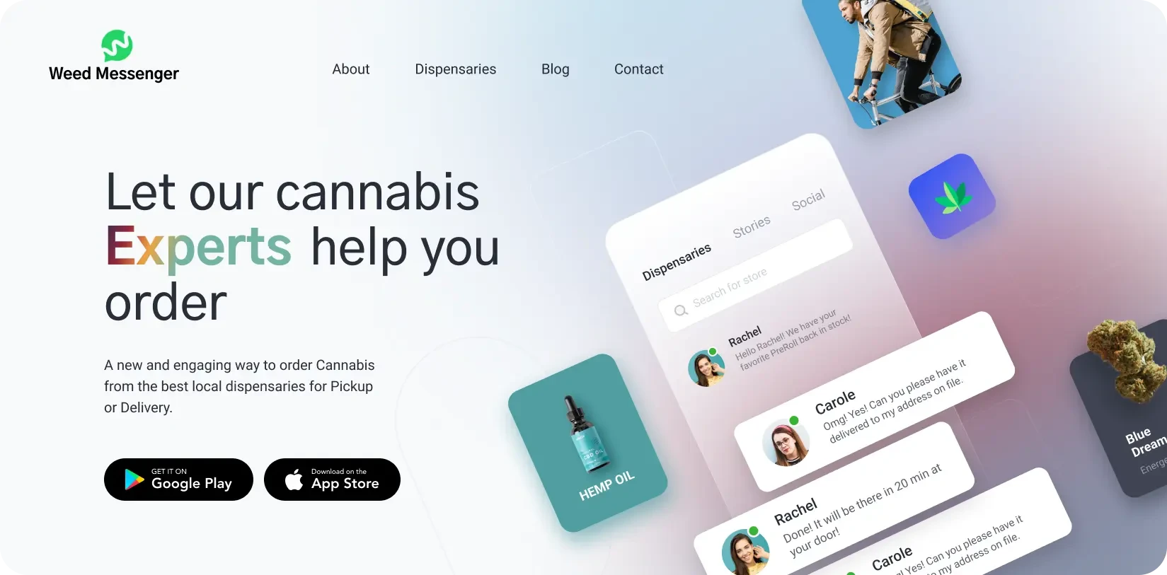
About Weed Messenger
Weed Messenger (WM) is a San Francisco-based technology company that bridges cannabis curiosity with confident purchasing. To simplify cannabis commerce, they use an AI-powered engine on their site. This engine offers live chat access to certified cannabis experts. These experts guide WM’s consumers to the right products from local dispensaries.
Users ask questions like “Best CBD for migraines?” or “Discreet sativa delivery?” and get personalized product matches in seconds. There’s no other company that offers such an innovative service in the North American cannabis space.
But WM’s old website screamed “generic template,” not “industry disruptor.” It was clunky. It was packed with stock imagery. It had zero investor appeal.
Goal of the Redesign
Weed Messenger needed to overhaul their website. So, they engaged our studio and asked, “Transform our site. Make it clearly articulate our market value to users and investors. Make it good enough to support our bold, future marketing initiatives.” To do so, we needed to:
- Architect an Investor-Centric Narrative: The central goal was to restructure the site to effectively narrate WM’s compelling brand story. The new design had to communicate the amazing market opportunity the brand was offering to investors. It had to highlight the scalability of their AI model. It had to subtly explain the market gaps their unique business model had already conquered or was primed to conquer.
- Design a Tangibly Intelligent User Experience: The platform’s “AI-powered” claim had to be felt, not just read. To do so, we had to fix the old site’s navigation mess. We had to add micro-interactions that felt like a smart assistant nudging the user. We had to make the user flows feel more responsive, intelligent, and premium. We had to make WM’s AI features more prominent.
- Establish a Modern, Trustworthy Visual System: WM wanted to position itself as a serious player. So, we had to ditch the old site’s stoner stereotypes. The new visual identity had to convey a sense of “Silicon Valley meets cannabis” vibe. It had to look sleek and ultra-professional, just like any other top tech startup’s website.
- Build a Foundation for Future Marketing: The new web design also needed to be modular. It had to provide a flexible foundation for future content marketing and user acquisition campaigns.
This was going to be more than just a facelift. The new design had to elevate WM’s online presence to ten new levels.
Challenges
WM’s old site was struggling to attract both users and investors. We weren’t surprised about facing these challenges during the redesign:
- A Misaligned Brand Aesthetic: That old site? Mushroom brown and pixelated greens. It looked like a 2008 blog filled with millennial cliches about stoners, not a cutting-edge 21st-century cannabis tech site.
- The Investor-Readiness Gap: No metrics. No problem-solution framing. Just buzzwords floating in space. “AI-driven!” …with nothing to prove it. The old site did not even try to properly explain why an AI-powered conversational eCommerce platform was a potent investment. Most investors scrolled through the site once and bounced.
- A Static and Unintelligent UX: Finding local dispensaries on the site required 4+ clicks. Live chat – one of WM’s primary features was buried deep down the homepage. Buttons didn’t react. Forms didn’t breathe. Users did not feel like they were browsing an intelligent platform that was cognizant of their needs. Most of them left before asking their first question.
No engagement tools. No micro-interactions. Generic, unimpressive messaging. Outdated visuals. Weed Messenger’s ambitions and its online presence couldn’t be further apart. This was going to take a lot of work.
Our Approach


Discover: Tearing Down Assumptions
We scoured through every major online weed dispensary. After learning what the industry leaders were doing, we turned to WM’s target users. Remote interviews, surveys, watching users browse the old site, and other usability tests revealed the following key pain points:
- New visitors from all segments had no idea what the site’s unique value proposition was, even after browsing for 30+ seconds.
- Older users wanted faster, more personalized content and responses from the site.
- Potential investors wanted to know: “How is this different from the other weed tech brands I’ve invested in?” seconds after browsing the site.
We started addressing these pain points by architecting a new website narrative. This narrative first explained the market problem WM was addressing – simplifying and personalizing the weed shopping process by giving users instant access to industry experts.
This was followed by explanations of WM’s one-of-a-kind, expert-guided AI weed commerce model.
This top-down approach meant that both investors + users could grasp how unique the brand is within seconds of landing on the homepage.


Define: New UX/UI Design & Microinteractions
With the new narrative locked in, we created a visual system to match its ambition. We completely abandoned the stale cannabis tropes for a palette that felt more like a premium fintech or SaaS app. Now, the site was feeling ‘premium.’
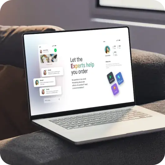
Our next task: “How do we make the platform feel intelligent?” To do so, we reimagined the user flows. The AI chat feature, previously buried, was made the central, persistent element of the UI.
We refined both target user flows. For the curious newbies, it was “Educate → Recommend → Order.” For the investors, it was “Problem → Our AI Fix → Growth Metrics → Contact Us.” To breathe life into these user journeys, we infused them with purposeful microinteractions:
- Loading animations for AI responses that mimic “thinking”
- Button-fill effects and subtle hover states that provide fast, tactile feedback
- Smooth page transitions
- Chat bubbles that pulse whenever experts are online
Design Highlights


We developed a new visual language built around a professional, tech-oriented visual design style:
- The new, modular website UI was built with Webflow for maximum CMS flexibility.
- Every button looked alive because they had 5ms hover darkening and 10px interaction shadow.
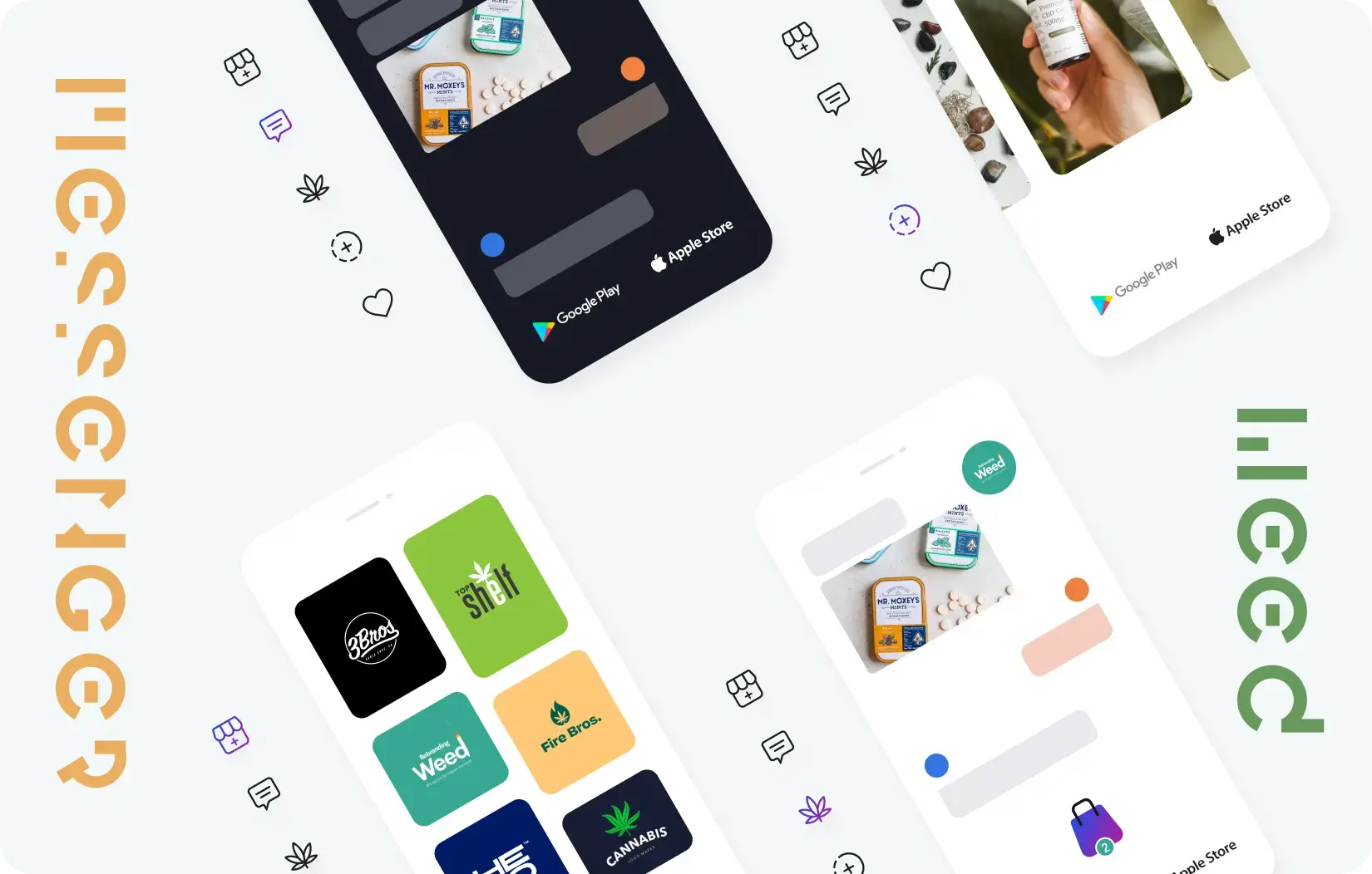
- We replaced all stock photos with commissioned custom visuals that explained WM’s value proposition.
The redesigned website helped Weed Messenger finally reach the heights it always aimed to:
- Investor calls increased considerably as the custom visuals and the targeted user journeys made the brand’s potential obvious.
- Session duration rates improved by huge percentages as users found the redesigned AI chat engine to be way more accessible and engaging.
- Chat engagement spiked massively as the micro-interactions made interacting with the site feel more human.
- Local dispensary partners also noticed WM’s rise in popularity, and the brand has found many new collaborators since the redesign.


Final Product Showcase
Weed Messenger’s new site finally presents the brand like the innovative, investment-worthy disruptor it is. Its user base is growing and extracting all the benefits its innovative tech offers. Investors are now seeing the brains behind the bud. Helping an innovative brand like this ultimately reach its potential was a huge joy for us.

![Thumbnail One]()
![Thumbnail Two]()
- Watch video on dribble.


Upcoming Case Studies


Happy Clients & Partners


“They gave a clear overview of the design and approval milestones and executed them accordingly. Communication and the work delivered were both top-notch. I’d highly recommend working with her!”


“We were looking for something creative and different from what everyone else was putting out there. And we found it with Design Studio. Great work!”


“Design Studio team were absolutely fantastic. Highly talented designers.”


“The DS team went beyond our UI redesign expectations. We are grateful for the work well done. Kudos.”


“The team was great, extremely communicative and patient with the project. I highly recommend it to anyone.”


“Design Studio did an awesome job. Their communication and timing were excellent. The quality of work was fantastic.”


“We’re thrilled with CRM Dashboard, Website design from scratch by Design Studio. They nailed the design and ensured flawless development and performance.”


“Design Studio created a beautiful, functional website and mobile app for us. Excellent communication and top-notch design!”


“Design Studio provided us with a sleek design and powerful backend development. Our user experience has improved dramatically.”


